


So, you have lately invested a huge amount of time, perhaps months, into your website design. It’s extremely amazing and offers an experience, unlike any website you have ever visited. However, why aren’t your visitors coming back and converting into customers?
As a business owner and marketer, you are more likely to have a skewed insight into your website’s design and functionality. As a result, you can often concentrate too much on making the design smooth and perfect instead of concentrating on those who will be converting.
You should let your guard down and acknowledge that your website design might have some faults. That’s especially true if you like to boost your website conversions. After all, you like to put your site visitors ahead of anything else.
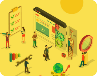
The #1 Mistake Businesses Make on their Website Homepage
Giving a huge amount of information is one of the things we often see on people’s homepage. Businesses often add as much info on their homepage to get their visitors to buy immediately. Nonetheless, what they don’t realize is that people don’t purchase after reading such information.
These people need a bit more warming up. It will help motivate them into your email list before purchasing from your site, but it will still depend on your offer.
What is a Website Homepage, and How Does it Function?
You can think of your homepage as your website’s reception area. It will direct visitors where they like to go effectively and easily. However, remember that your homepage is not the place to go into details about your offerings or business.
People land on your website seeking different things such as:
- your visitors like to read your blog
- they like your contact information
- they like to learn more about the products or services you offer
- they like to learn more about you
Your job is to make it clear to them which route to go. Your homepage is created to get your visitors to the next page of your website as efficiently as possible.
So, how can you convert your visitors into customers? You may already hear of the term ‘bounce rate.’ It’s the percentage of individuals visiting your site and leave without acting, such as filling out a form or clicking on other pages.
That indicates your visitor bounces off your page. That could be a sign your page is not working properly. Getting and designing your homepage properly will help avoid that issue and boost conversions.
Critical Elements You Should Include in Your Website
These homepage design tips can motivate you to rethink your website to boost your overall conversion rate.
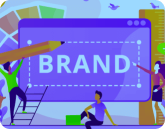
Tagline
When we talk about marketing, a tagline is the mantra of your business, telling people who you are and make you unique in just a few words. The purpose of this is to establish a positive and unforgettable phrase, which sticks in your audience’s head and helps them determine your brand and your marketing message.
As soon as your visitor lands on your site, they should get a good understanding of what you do. Adding a statement or tagline about your business above on your homepage will help a lot. First, however, you need to ensure your message is clear and precise enough.
Don’t assume that your audience will understand what you do precisely. Do you need to make that clear, okay? It will also help if you concentrate on your reader and not on your business.
Call to action
Your homepage should not be a porch of your home or website with only one door. Instead, it must be more of a corridor with different characterized doors, each leading your visitors further inside your home based on their existing requirements.
Unless most of your visitors come to you with the same goal, you need numerous doors. A call to action is a button helping get your visitors to do something like downloading a free PDF, visiting another page, or more.
For instance, you can make your CTA unique by designing it beautifully. Please put it in a different color, or you can add a border around it as well. You can see many CTA buttons, which blend in with the whole website and look beautiful. However, that’s not what you like to achieve. Instead, you want your CTA to catch your visitor’s attention.
Promotional area
In case you didn’t know yet, this is the area below your hero section. That’s where your homepage should work hard to get your traffic to where it should go. In short, they’re your homepage’s traffic cop.
It should be composed of one word concluding your service. Don’t make your promotional area too busy. It should not be composed of paragraphs.
Also, don’t give your visitors too many options. So often, websites tend to provide many services and try to get their visitors to choose one. Nonetheless, those options are a lot for the brain to handle. Therefore, it will help to add at least three to four services maximum in your promotional area.
Opening paragraph
We understand how challenging it can be to write your website’s opening paragraph. It feels like you have many things to talk about yourself and what you do and try to fit it in a short space.
To help you in this dilemma, it’s recommended you don’t make it about you. Instead, talk about your audience in general and the things you can do for them. For example, when we talk about writing your introduction, emphasize your audience and introduce the things you do.
Your headline is the first piece of copy your visitor will read on your homepage. However, your goal should not be to get your visitors to interact with that first opening paragraph. Instead, the purpose of your opening paragraph is to motivate them to keep reading and move through your page.
Basically, it obliges them to want to learn more. So, as you create your opening paragraph, ensure that the copy efficiently grabs your reader’s attention.
Further sections of text
The last thing you want to do about your homepage is making it too long. Remember that your homepage’s goal is to draw your visitors to click to other website pages. Nonetheless, you may like to add more sections on this page to help you accomplish it.
Other sections you may want to add may include:
- About us – This may be a section that talks a bit about your company and how you can help your customers. It normally has a CTA button leading to your About Us page.
- Product or service highlight – This section aims to highlight some of your product or service offerings. Of course, you can add a CTA button that will lead your visitors to the corresponding pages.
Lead capture
Did you know you can also add a lead magnet to motivate your visitor to give their contact details like their email address? That lead magnet could be a freebie like a how-to guide, PDF, or others.
You may have heard of this, but your visitor should see your message at least seven times for them to purchase from you. Take note that you can’t guarantee these people to keep coming back to your site. Hence, giving them a lead magnet in exchange for their email address is a good idea.
For instance, are you planning to give your visitors a guide or cheat sheet? It will help if you show what it looks like. Make it look meaty and feel like a real item. That’s one way to boost your sign-ups.
Social proof
Finally, you like your homepage to develop authority and trust with your visitors and audience. You will find two ways to do this: use logs from the places you have been featured on or testimonials and awards you have won.
Do you plan to add testimonials? It will help if you make them interesting. You can add statistics about what was accomplished and highlight what it was like to work with your business.
Meanwhile, how can you incorporate your awards without bragging too much? Don’t forget that the level of excitement by your customers and yours are different. You can add the logo of the award you have achieved, but you don’t need to harp on about it on your entire homepage.
Final Thoughts
Every time a site visitor lands on your website homepage, they are critical things they should see. For instance, they expect to understand your products or services and find crucial details about your store.
That’s why you need to follow best practices. Your customers are more likely to purchase if they can navigate your homepage with ease and speed. Now, it is time you take the first step!
Which of these homepage best practices are you following? Please share your thoughts with us by leaving your comment below! We wish you the best of luck!
If you need further help with this topic, you can contact Web Digital. Aside from offering web design services, we also provide web hosting and other plans. Web Digital is a well-established web design agency, and we can help you with your website design needs.